
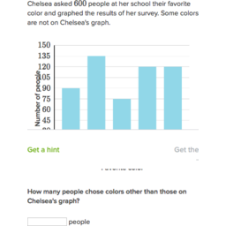
Bar Graph
Bar graphs are easy to read, show clear information and are great for displaying categorical data, or common data that falls into categories.

Source
Histogram
A histogram is very similar to a bar graph, the only difference is that the bars touch each other because it is showing two or multiple groups of data.
Source
The Pictograph
A pictograph is what we used for the m&m's previously. They are continuous and appear to be easy to read, but it is difficult to see exactly how many of something it is displaying.

Source
Pie Chart/ Circle Graph
Pie charts are super easy to compare your data with. You can look at one immediately and see, for example, that there are more penguins than llamas. They are not very easy to make by hand, but they are very precise. They also use categorical data.

Source
Line Graph
Line graphs are quite simple and very common. They typically show trends over time and are continuous, with numerical data, meaning they show numbers of something. The dots are the where the data is found and the lines simply connect the dots to show whether the trend is positive, negative or neutral.

Source
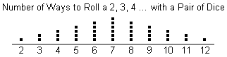
Dot Plot
This type of graph might be my favorite. They are easy to read and can be great to use with large portions of data. This is what we used as a class for the m&m's. They can show areas of clusters where numbers are grouped together and visually display how many are connected to each number. They don't show specifics, but in general it is a good graph to use.
Source
Graphs and pactice
Heather I love how you had a picture of each type of graph that you talked about so that everyone can understand and picture exactly what you are talking about.
ReplyDelete